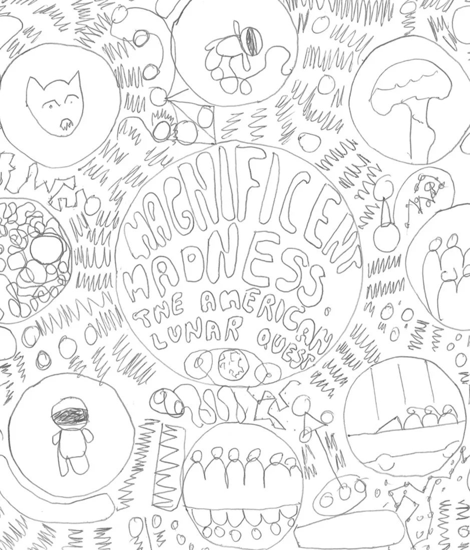
Magnificent madness: Sketchbook
Heres a few pages from the sketchbook for the Magnificent Madness poster. At Make Believe our design process typically starts with research, broadly gathering visual and written material on and surrounding the content being communicated. From there we create mind-maps, generating associations between various aspects of the research. With this foundation we are able to explore both traditional and experimental approaches to resolving a communications problem. This can involve a range of techniques including sketching, collage, experimentation with media and colouring.


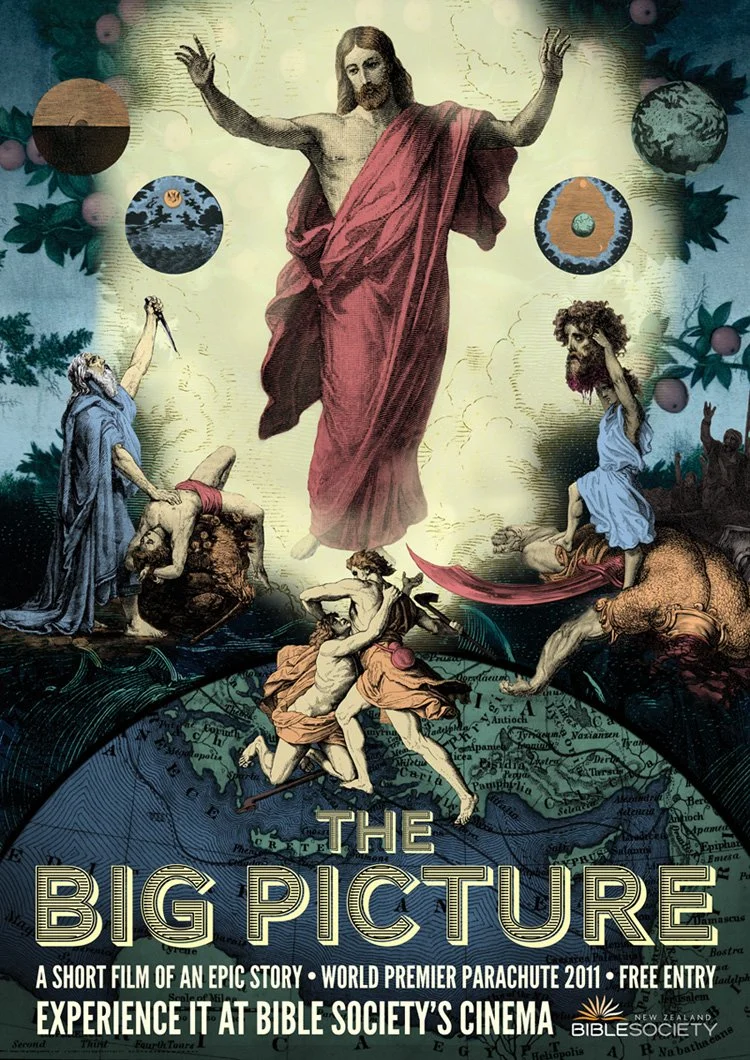
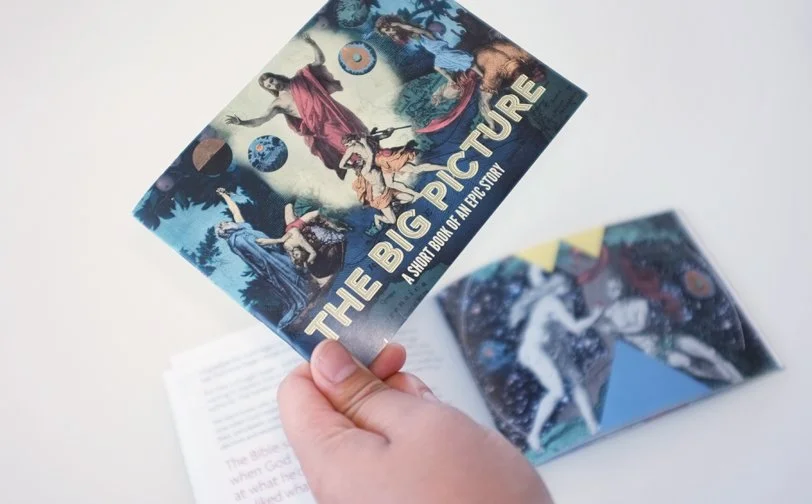
The big picture: Event branding
The Bible has a long and rich visual history. The strategy Make Believe developed the branding of this event was to harness this heritage but to present it in a contemporary manner. This was achieved by imitating the design of posters advertising Hollywood blockbuster movies.
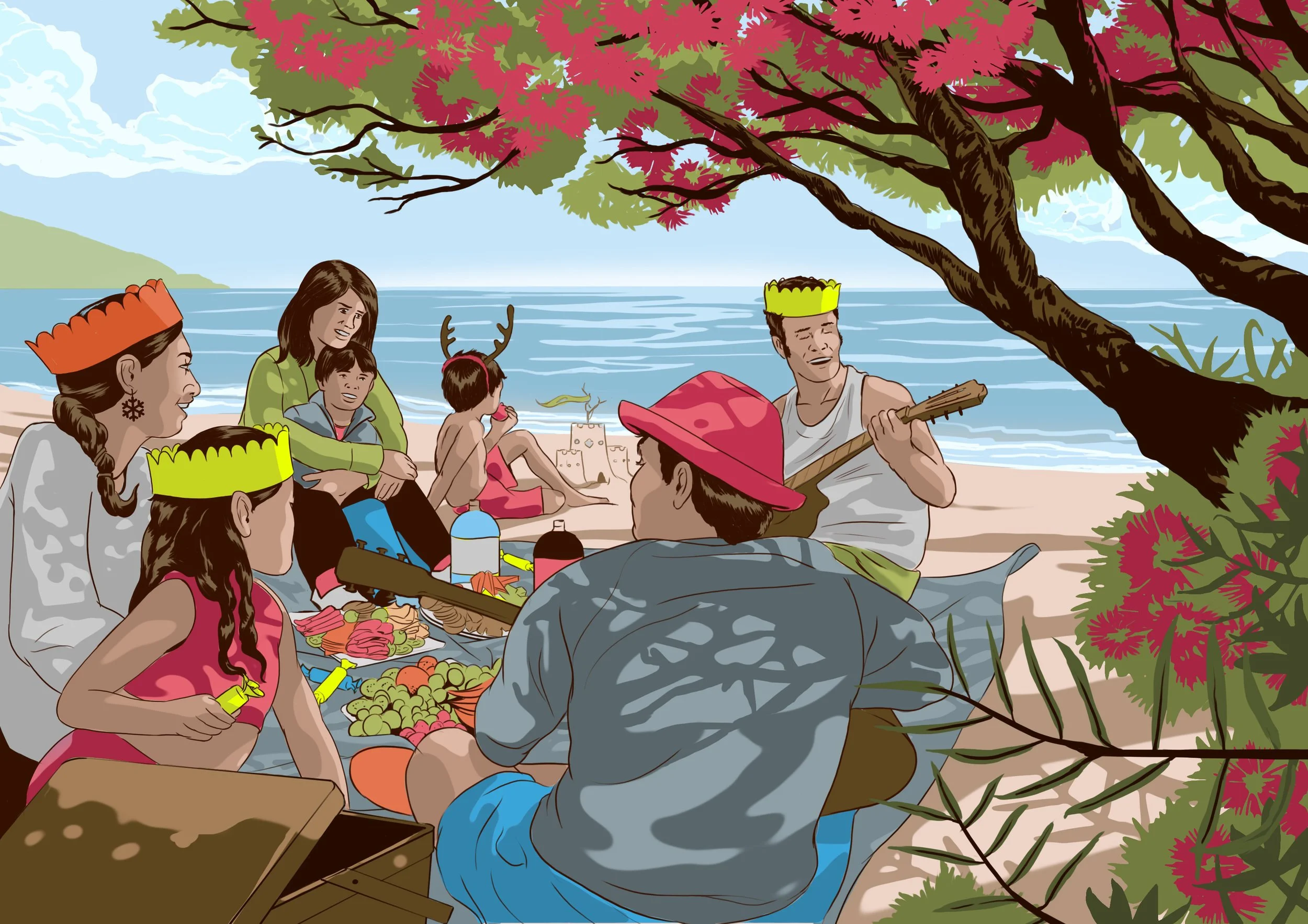
Christmas cards
In collaboration with the illustrator Vaughan Flanagan we created a set of Christmas cards celebrating the classic Kiwi summer. Vaughans skill with colour, line and his ability to capture social moments makes them some of our favourite illustrations of life in New Zealand.


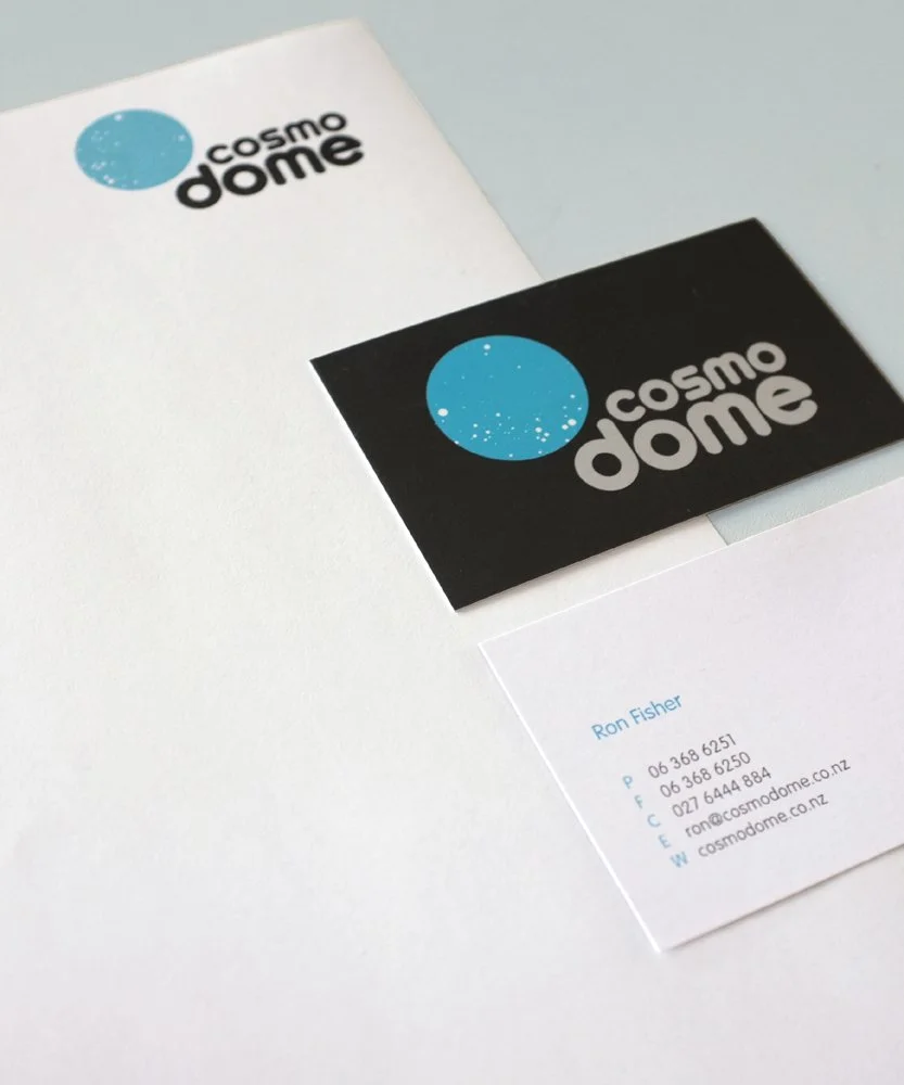
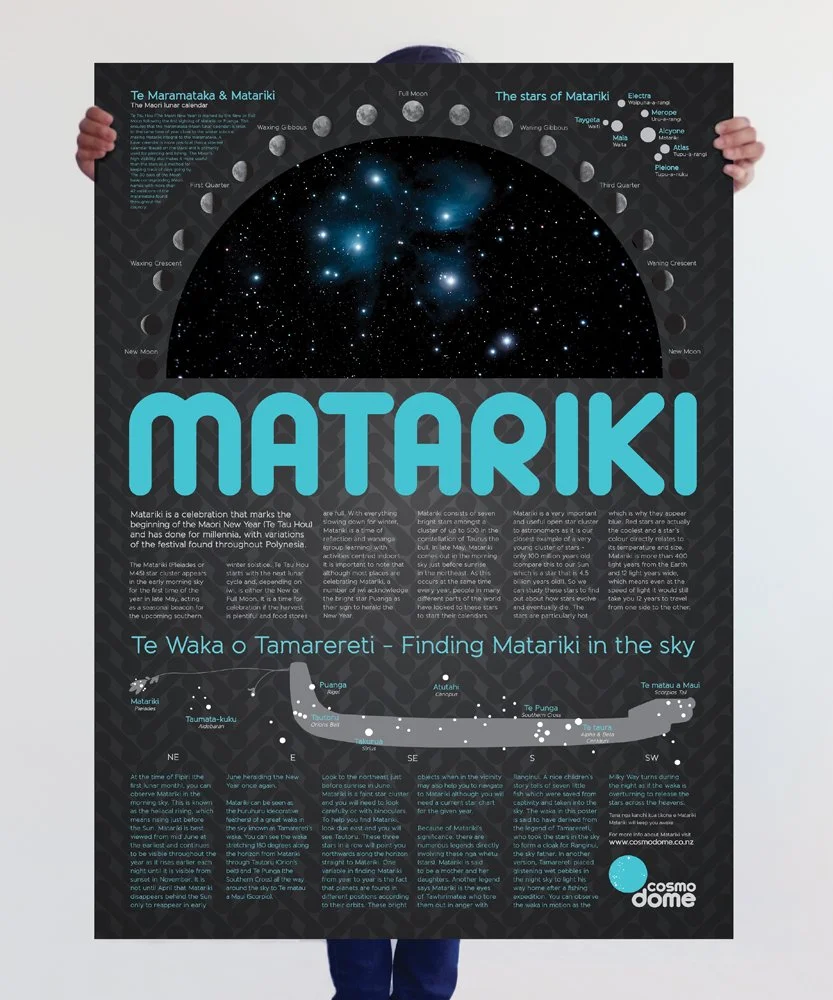
Cosmodome branding
Cosmodome is all about making astronomy easy to understand. To capture this brand value Make Believe developed the strategy of beautiful simplicity. The identity use the circular forms in the typography and motif are intended to mimic the planets. The logo depicts the brightest of the southern stars.
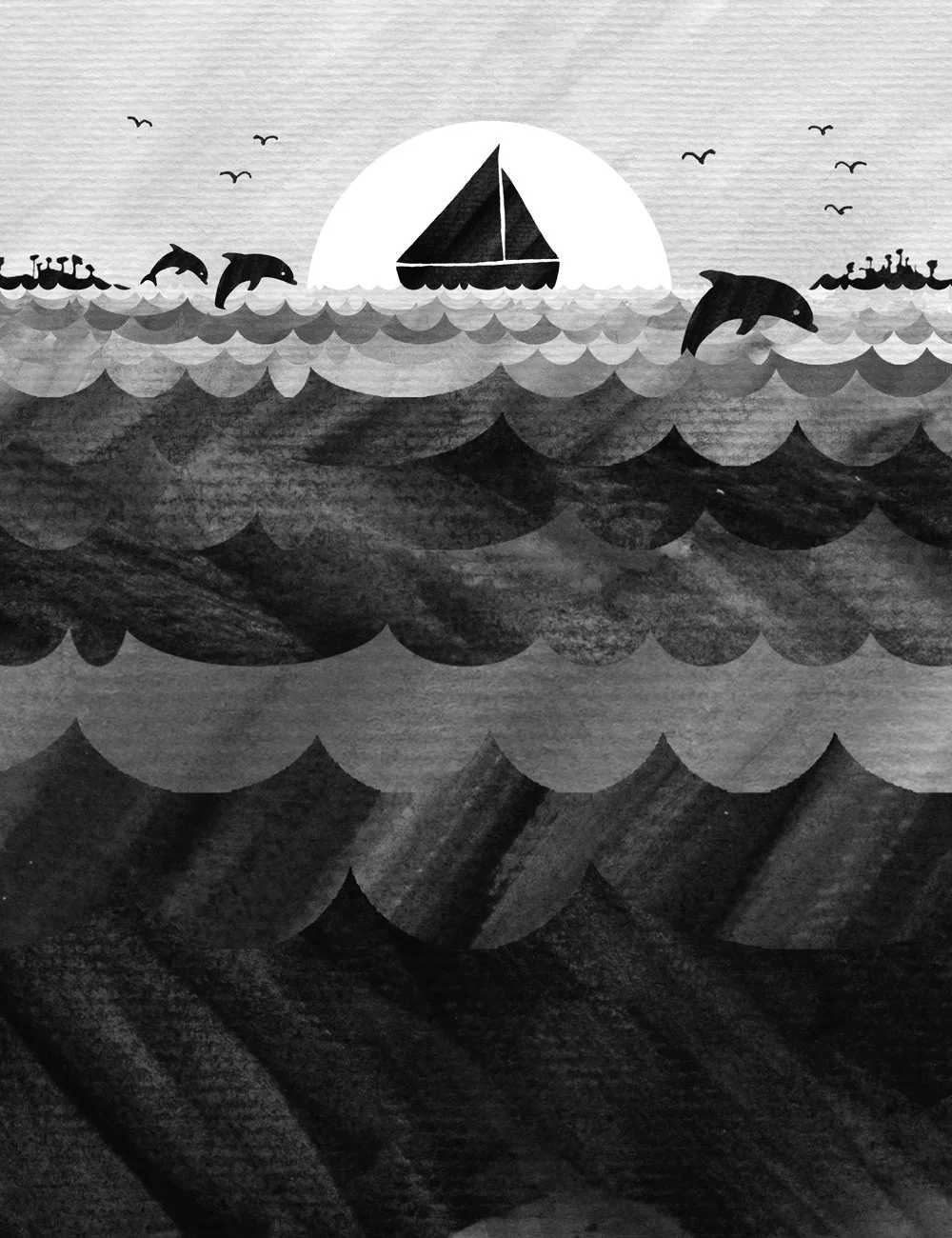
Illustrating in black and white
So this was a little experiment on how we could use restrictions to encourage creativity. Limiting the colour palette to black and white meant that definition and detail had to be achieved through layering variations in tone and texture.
Farmers market identity
The point of difference for this farmers market was that all the produce was locally grown. The branding Make Believe created reflects this by imitating the typographic aesthetics of hand painted signs used by local fruit and vege growers.


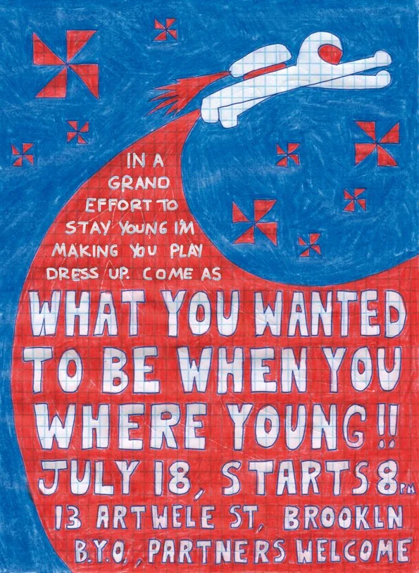
When you where young
Everyone wants to be a spaceman. Adventurering across the vast voids between stars, solar systems and planets. So when it came time for us to design an invite for a dress-up party themed on childhood aspirations, a space doodle seemed appropriate. Drawn with coloured pencils, pen and math paper to capture the day dreaming imagination of childhood.
Yayoi Kusama Exhibit
Have just been to the opening of an exhibition by the Japanese artist Yayoi Kusama. She is an installation artist with an obbsession for dots. The best part of the exhibition was a room you got shut into that had mirrors on the walls and ceilings and water on the ground, it was pitch black aside except for thousands of tiny little lights like fireflys. They all got reflected of the mirrors and the water. It felt like you were floating in outer space. She also had a room that seemed like it was the inside of her brain, mirror balls that floated in midair and she covered the City Galleries exterior with dots.

White wedding
This wedding invite Make Believe made celebrates the couples love of old things. The design reflects this by reusing the words of Billy Idol and a collection of kitsch white wedding items collected from op shops. The colour and typography establishes the events visual theme.


Castle of colour
Ludwig II, who built the castle made famous by Chitty Chitty Bang Bang was also known as the Fairy Tale King. So, we decided to make this illustration is an attempt to keep the castle in a place of fantasy. A world of wonderful technicolour, unicorns and flying cars. A childlike impression of this architectural marvel is captured by colouring between the lines using dried up felt pens.

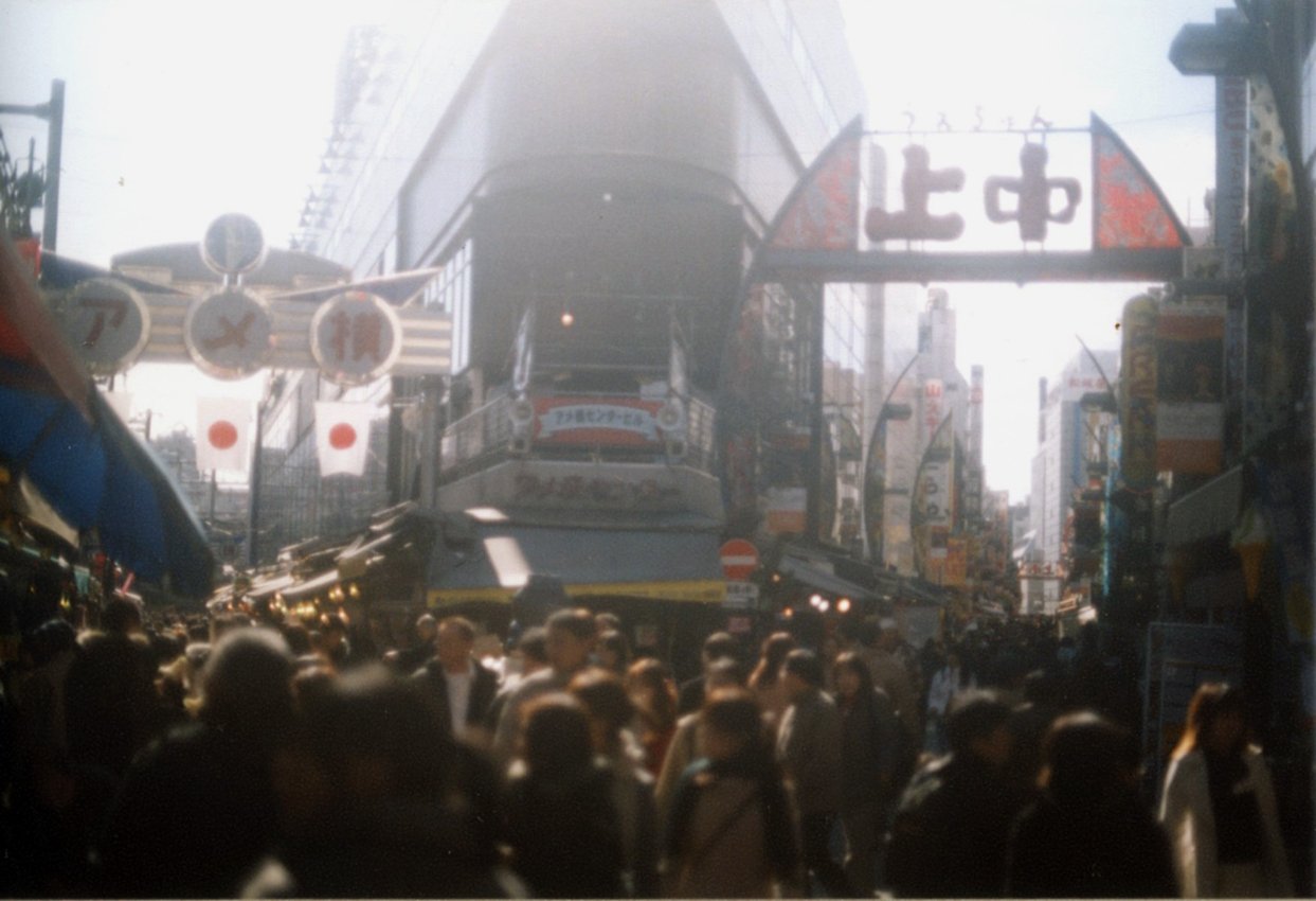
Photographing Japan
Here's an attempt to sum up 9 days in Tokyo in two photos. The first image pays homage to Japanese tradition by depicting the iconic Mount Fuji. The second aims to capture an enduring impression one gets from Tokyo - that despite being teeming with life it is a very peaceful place.

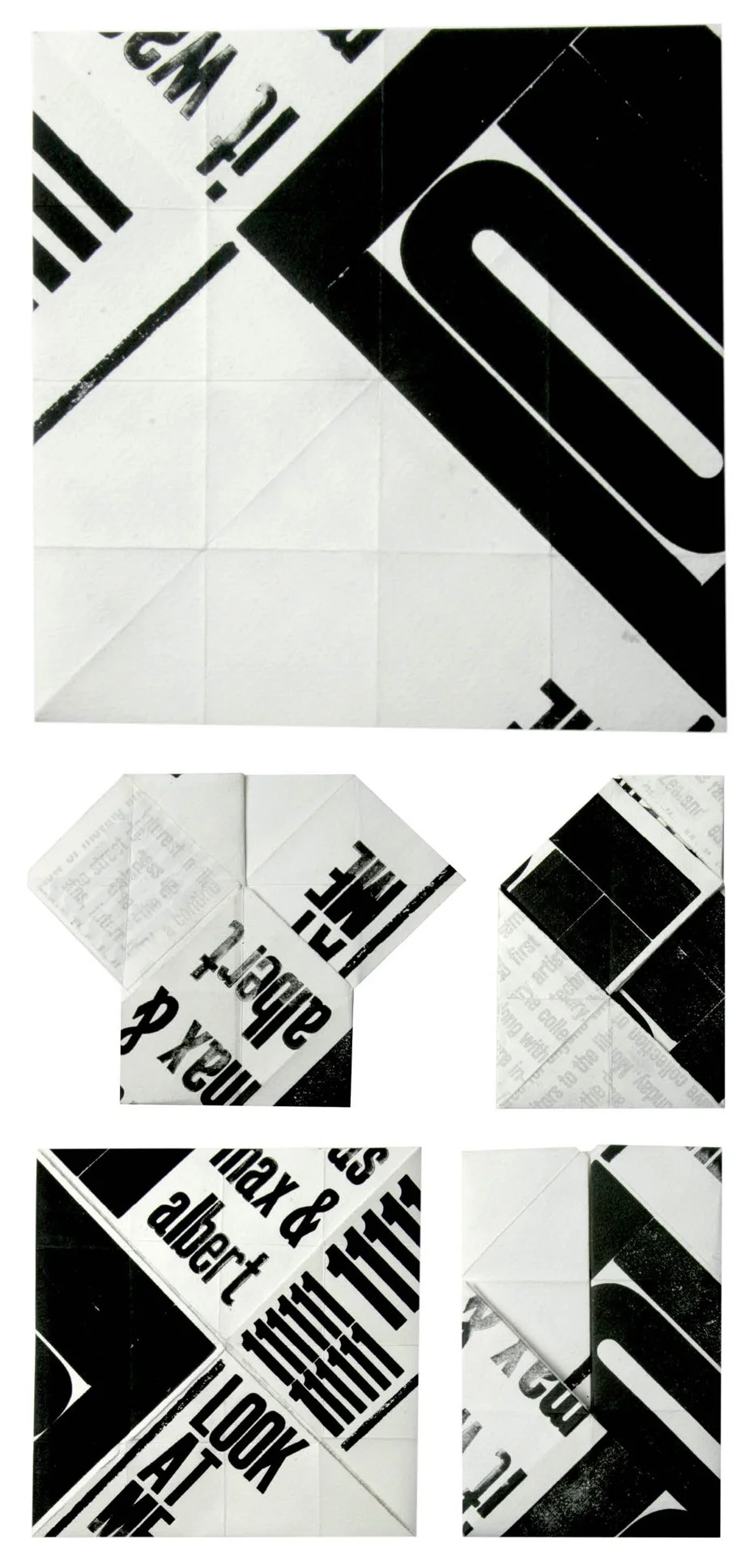
Letterpress
We made this design to investigate how the National Film Archive could be represented through a typographic visual metaphor. The complex is divided into four unique but united spaces. This was translated into a design on origami paper that encouraged playful interaction and experimentation.
Voodoo girl
The brief for this illustration was to depict the scene described in Tim Burtons poem Voodoo Girl. We used water-colours to help create an eeire effect and enhance the original visualisation of the poems characters.


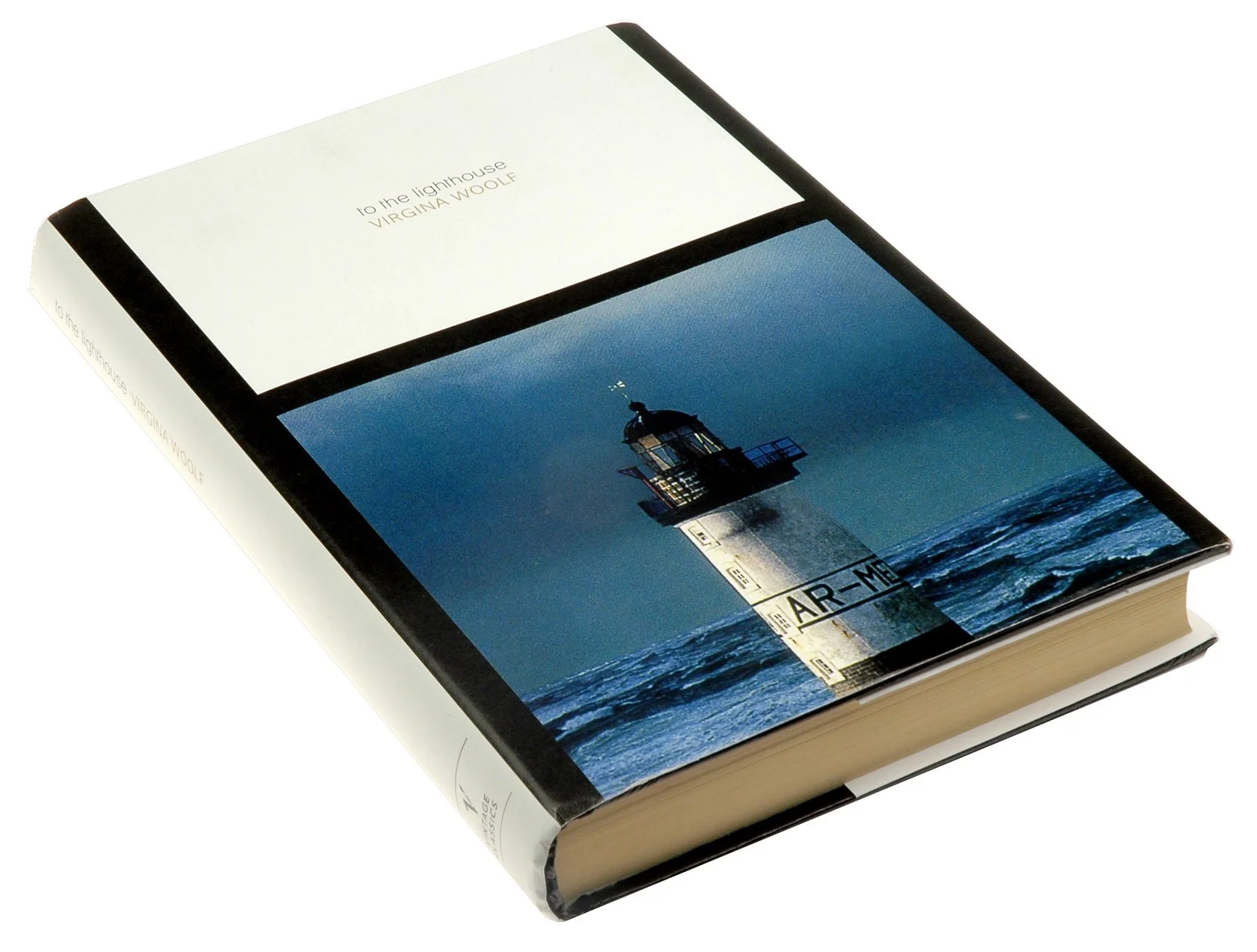
To the Lighthouse: Book cover design
Our proposed re-design of Virgina Woolfs classic book To The Lighthouse. One of the themes is the difficulty of obtaining intimacy with others. This design aims to convey that feeling. The photograph of a lighthouse and the separation of graphic elements serve as a metaphors for isolation.
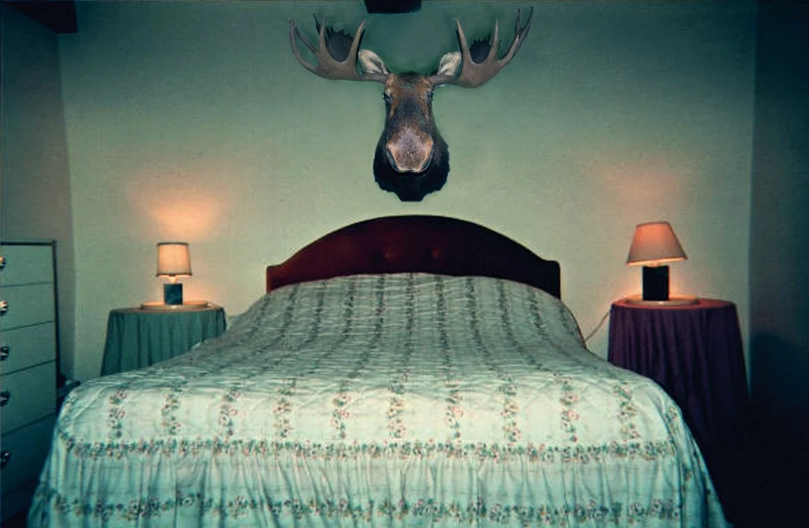
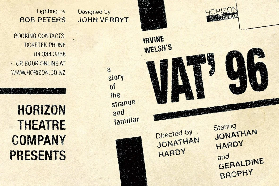
Vat 96: Postcard
The brief for this project was to create a postcard that promotes the unusual play Vat 96. Our design uses the moose in the bedroom and the disjointed type to allude to the stories twisted sexual politics.
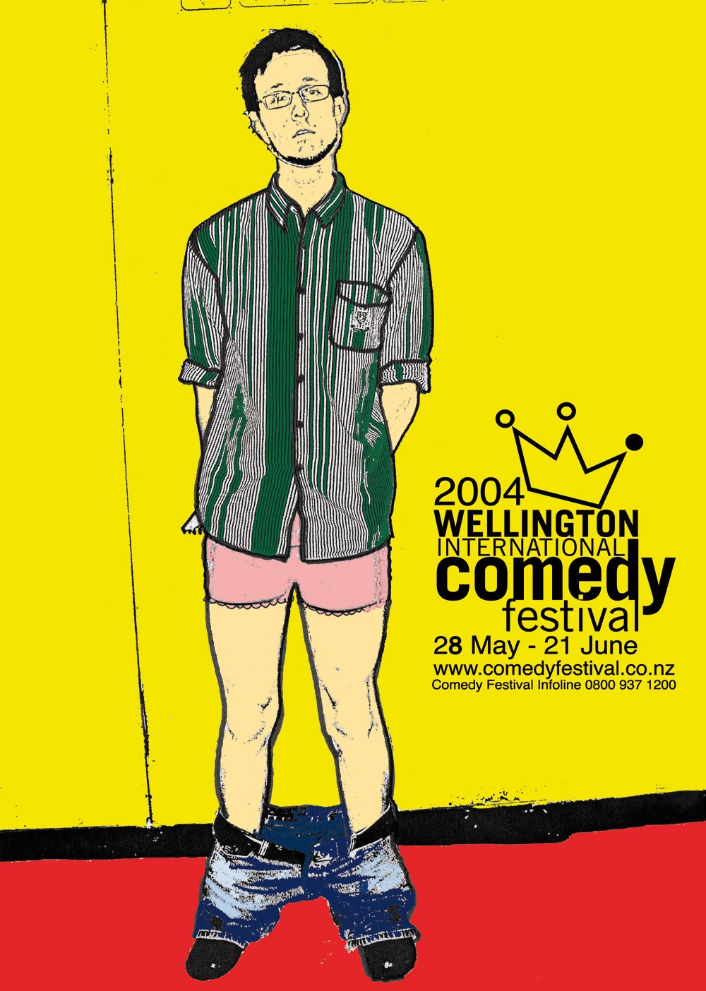
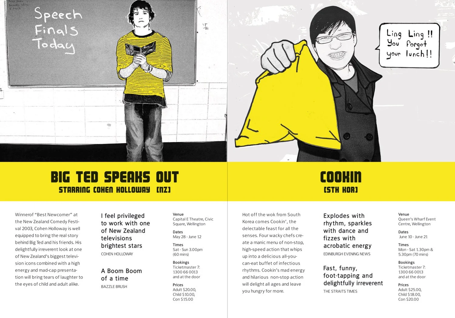
Comedy Festival
This is Make Believe’s design proposal for the Comedy Festival publication. We photographed the acts and then retouched the imagery to appear cartoonish and playful. Yellow, the colour of happiness, visually unites the brochure.

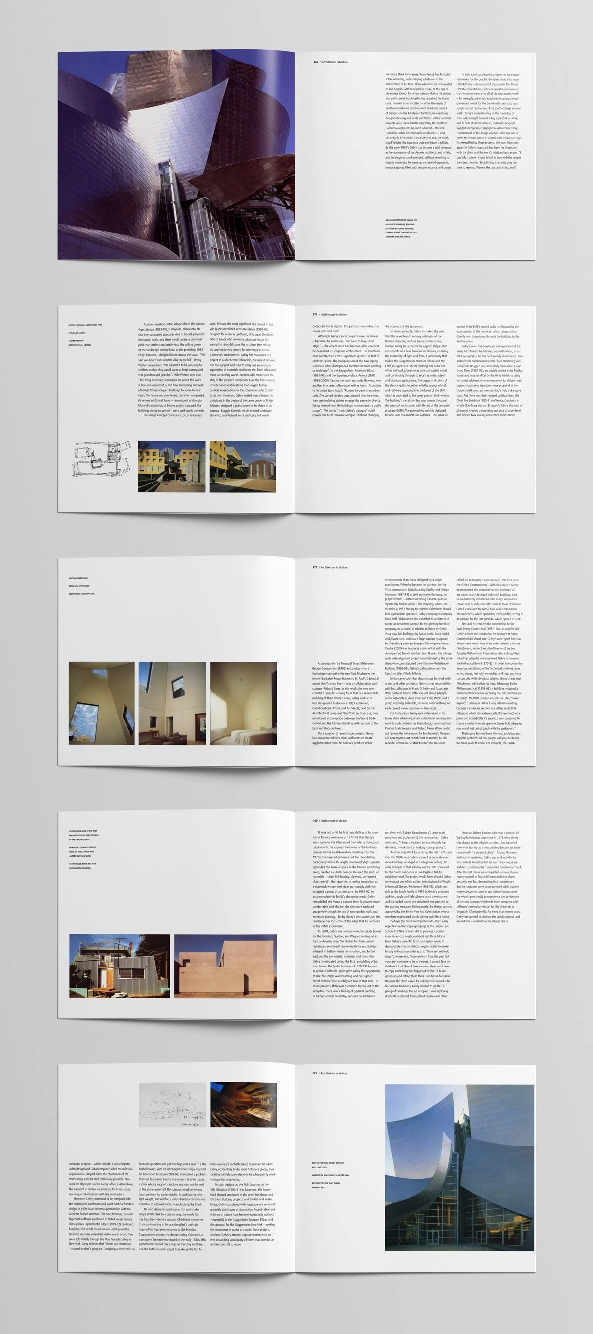
Frank Gehry: Book Design
This book design proposal by Make believe is a celebration of the architect Frank Gehry. It uses white space, captions and blocks of text to create a structured rhythm inspired by his body of work.
Hubbards: Thank Goodness
This ad takes inspiration from the letters to the CEO of Hubbards that get published inside the cereal packets. It takes advantage of a childs naivety to draw attention to the products gluten free status.
