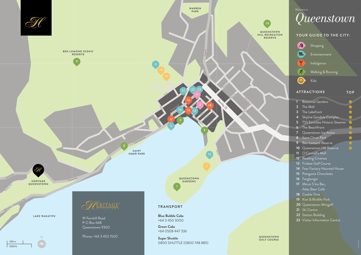
Heritage Hotels: Concierge map
It seems just about every designer loves maps, so Make Believe jumped at the chance to help create a set of concierge maps for Heritage Hotels. The maps pinpoint key attractions in various destinations throughout New Zealand. Designed with Salted Herring.


1 view, 2 perspectives
The studios new Mamiya 7ii has arrived, so we thought it appropriate to take it for a test drive. Here's a couple of snaps of the same view taken from different perspectives on either side of the bay. Really love the colour and detail that the old medium format brings to the photo.


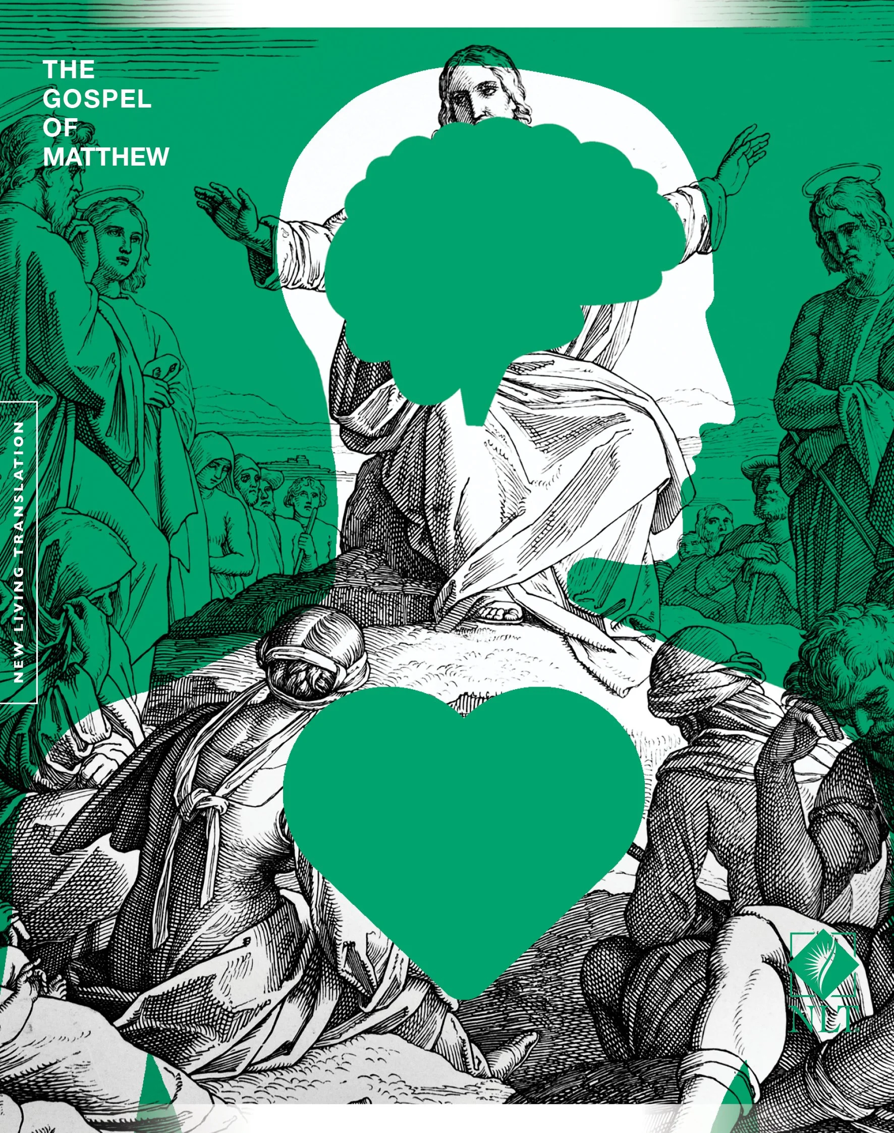
Gospel of Matthew: Book cover design
Here's the latest book cover design that Make Believe has proposed for Bible Societies gospel series. One of the key themes the author draws on is that Jesus was a philosopher, a thinker that understood the relationship between head and heart. The cover design reflects this with a layered combination of vector art and etchings.
Photographing Kepler track
Over easter a few of us hiked the invigorating Kepler Track. It was inspiring to get away from the computer screen and get in touch with nature. Our first night was spent atop Mt Luxmore. As evening fell, mist crept up the mountains, joining us in our slumber. The next day we woke to a dream as our hut sat floating above the clouds. We continued our trek along the ridge-line while the mountains surrounding us magically vanished and in and out the mist. It was like walking through a land of make believe.

White Night: Event branding
White Night is an evening arts festival. The logo, visual identity and website is inspired by the oxymoron inherent in the brand name. The event branding, went on to win a Bronze at the 2015 Best Awards. Designed with Salted Herring.


Heritage Hotels: Poster desgin
The Heritage Hotels ‘Best Destinations’ campaign sought to highlight how Heritage services the top tourism destinations throughout New Zealand. To achieve this, we crafted a flexible typographic system and a set of evolving assets that could be switched out to suit the changing needs of the market, such as promoting summer versus winter holidays. Made with Salted Herring

Start with why: Simon Senek
Here's a great Ted Talk by Simon Senek. He discusses how great brands like Apple build their brand from the inside out. Their distinct identity comes from why they do what they do, rather than what it is that they offer. Check it out.
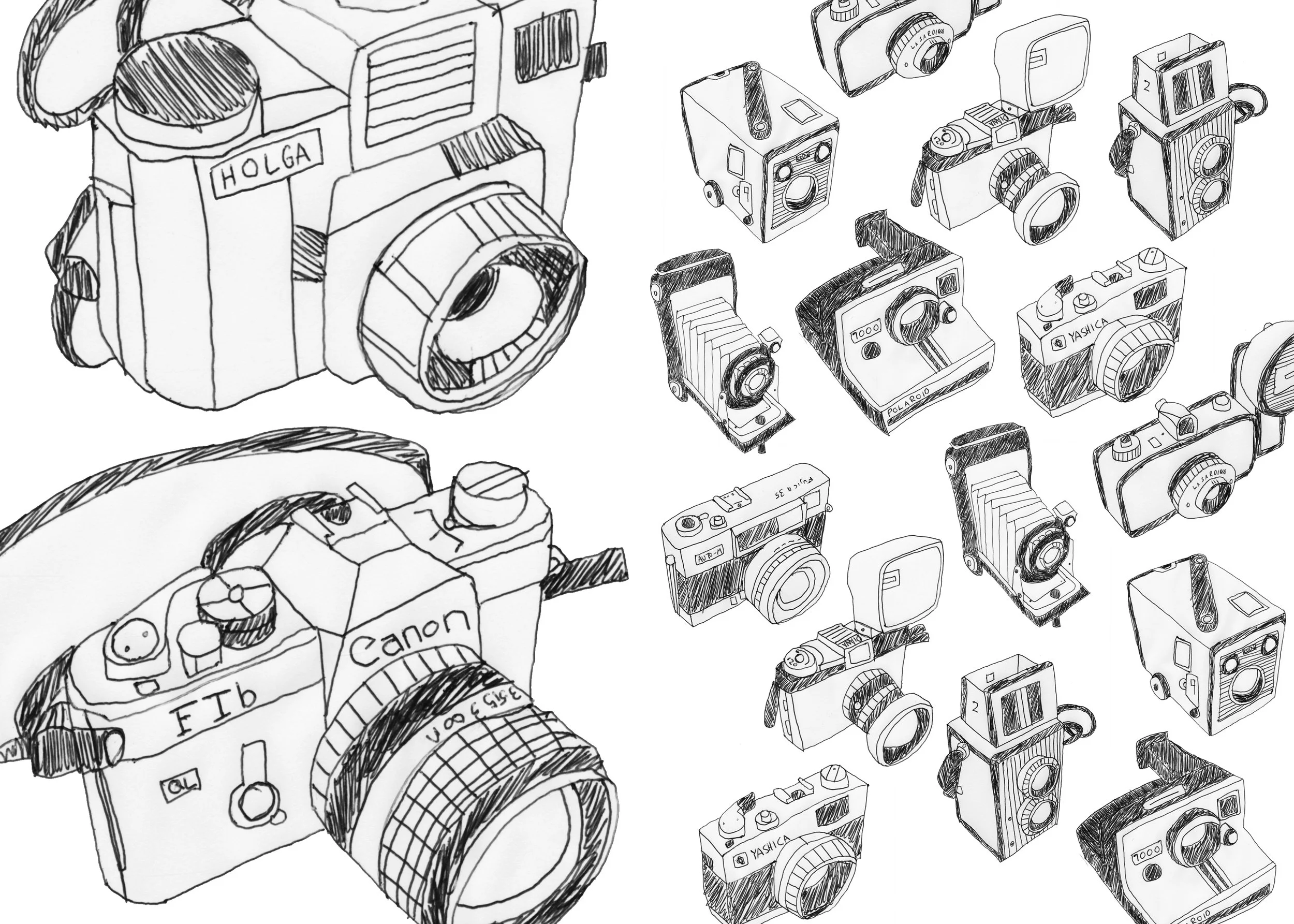
Camera sketches
Decided to draw some of the cameras in our collection. Here's the results.
NZ Bible Month: Logo
This logo was developed by Make Believe to assist in establishing Bible Month as an iconic festival in the Christian calendar. The branding draws on the shape of an angled leather Bible, allusions to a halo, kiwiana motifs, and authentic handcrafted typography. Enjoy.
Semi Permanent: Auckland 2014
We visited Auckland again for Semi-Permanent. My favourite speaker was Ian Wharton author of ‘Spark for the fire’ and creative director at AQKA. Their motto is - ‘Avoiding the beaten path, seeking terrain unexplored’. His presentation focused on the need for creative people to practice ‘Youthful Thinking’. He discussed how all design should be useful, useable but most of all delightful. He believes relying on experience can limit creative output as it can too quickly dismiss unusual ideas. He spoke about embracing intuition and ridiculous whims as a means to expand creative potential. Youthful thinking can also be practiced through embracing curiosity, being playful, pursuing change and new disciplines, following ones passion and not fearing failure. He encouraged everyone not to limit their creativity through inaction. I took it to mean that its easy to overthink ideas; it can be better to express them through the physical act of creation and exploration.
Abbot Miller author of ‘Design and Content’ and partner at Pentagram spoke about how design is a way of interpreting and representing context. He believes that designers are mediators; immersing themselves into new worlds with each project, using the structure of design to communicate content. He believes in the need for ravenous curiosity, design that’s driven by ideas, and that the only way to do it is to do it.
M/M Paris spoke. Their work was some of the most beautiful, expressive and indulgent I’ve ever seen. They are so prolific too; they pursue the creative life with vigour. They talked about how every image should act as a handshake, an introduction, a greeting, a conversation starter, drawing the audience in through layers of meaning. They concluded by stating that the act of drawing sits between the seen and the unseen. ‘Just like an ant walking on the edge of the visible’.
Other notable speakers included: Mike Mizrahi, he believes in establishing visceral connections with your audience with whatever tools you have available to you. Tiffany Bozic, is an illustrator of beautiful unnaturally-natural histories. When asked what the future held for her she said ‘I want it to be a mystery’. I like the idea that some things remain unknown or unexplained, mystery is good for a curious mind. Matt Willey is a graphic designer who likes to bring a sense of the poetic to creativity. His redesign of the Independent newspaper was intelligent, beautiful and inspiring. Nat Cheshire, the architect responsible for the 2014 House of year and much of the Britomart redevelopment talked about how passion, ambition and handwork makes great design.
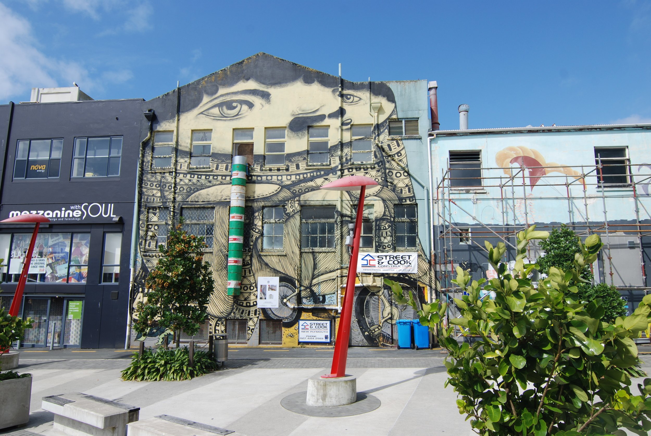
Photographing street art 2.0
Since our Wellington Street Art post back in 2012 it has become an obsession of ours to hunt out and capture all the street art we can lay our eyes on. It's been a thoroughly enjoyable way to explore the city; and a great excuse to travel to other parts of New Zealand. A recent trip to New Plymouth had us discovering huge walls of colour that ripped your eyes out of their sockets. The standout favourite was a of a golden head exploding through swirling shards of pink and mint green. Check em out.


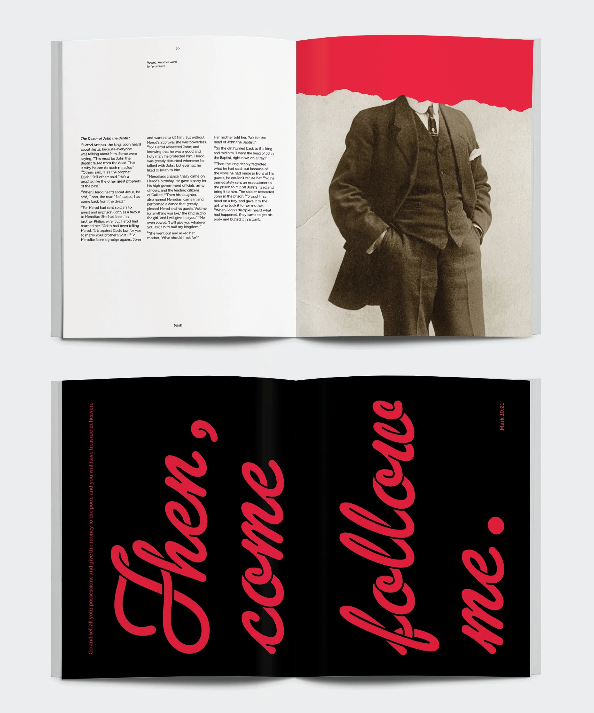
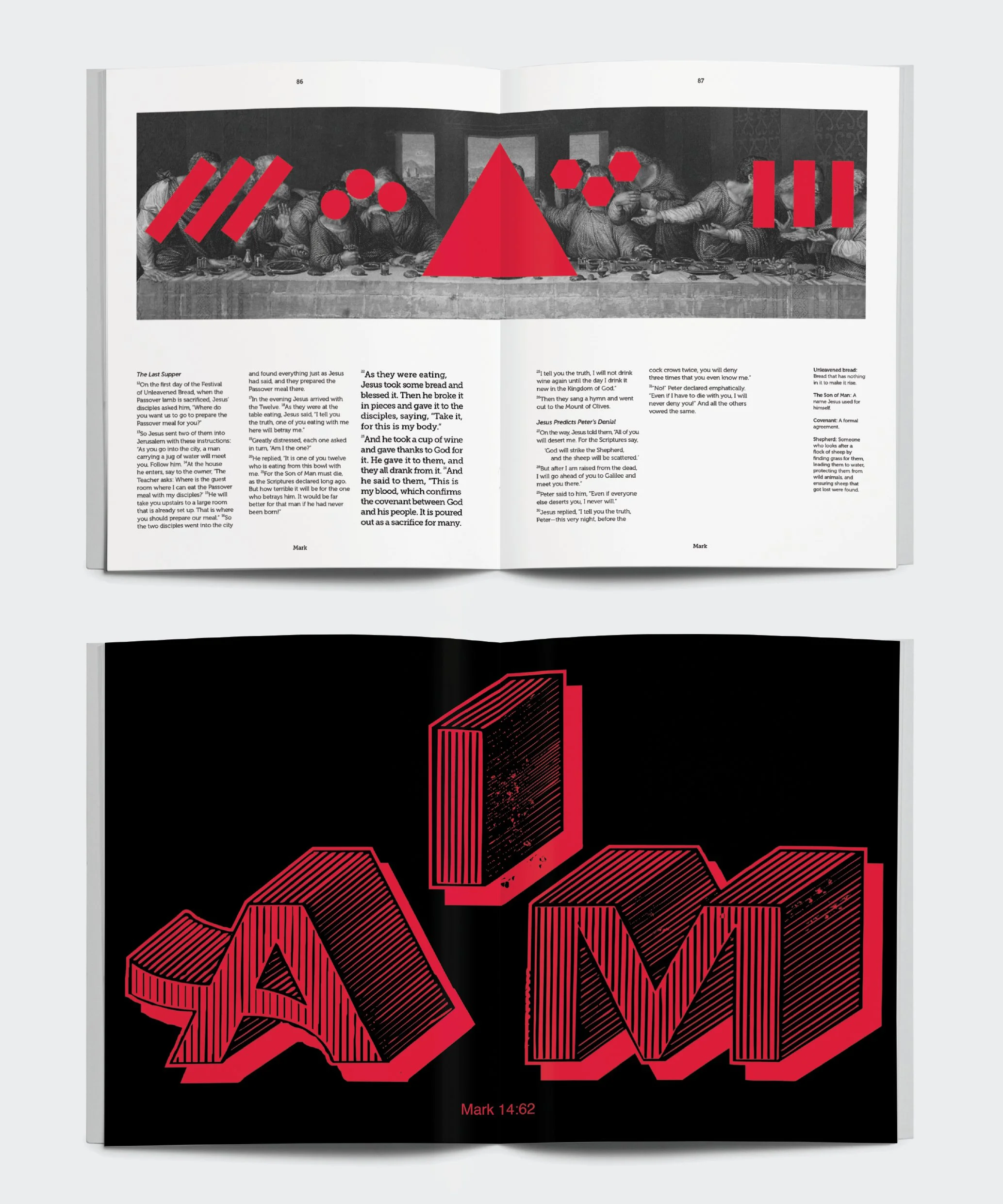
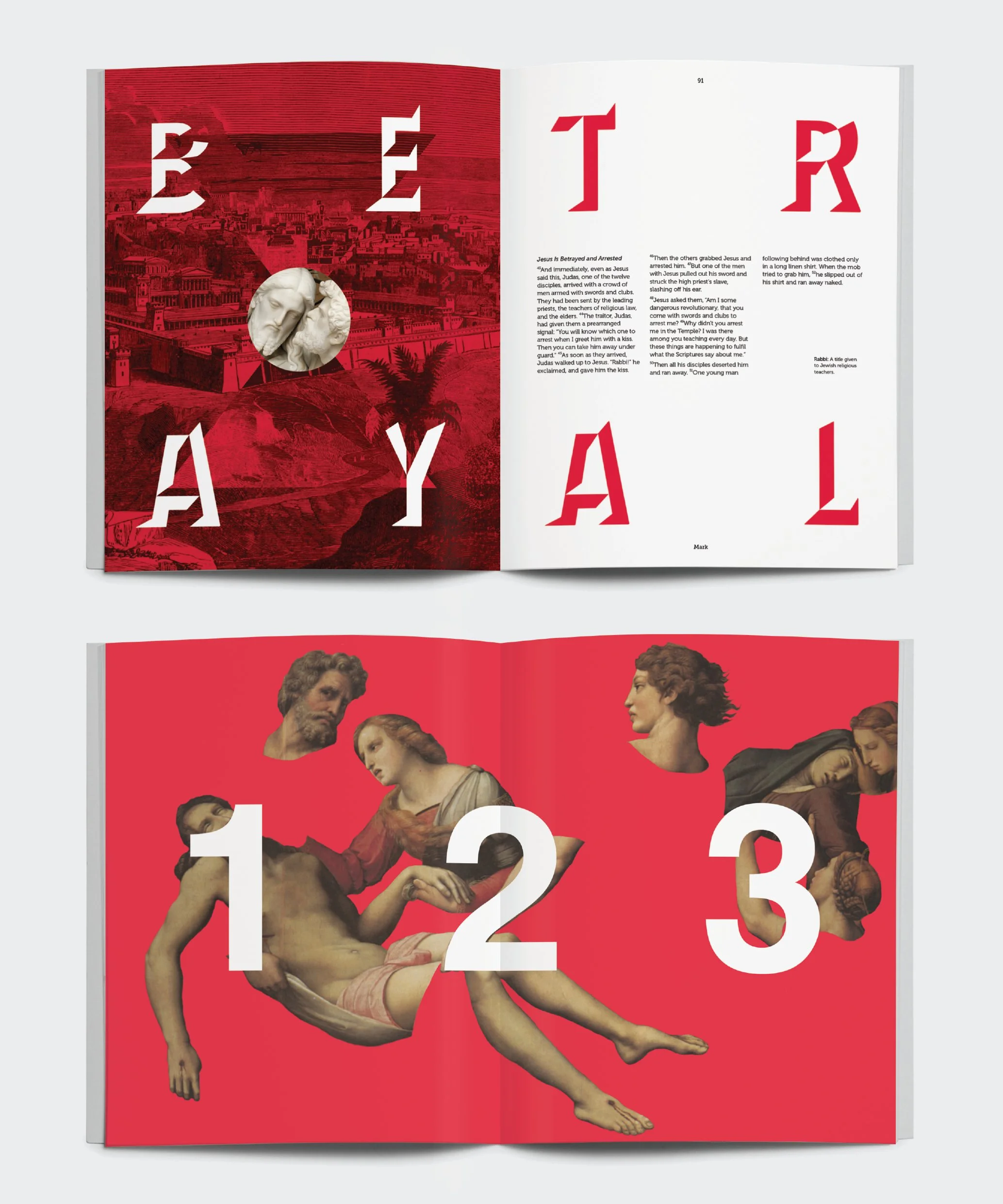
Gospel of Mark: Book design
Make Believe's approach to this book design was to flip readers expectations about how the Bible should look and read. This was achieved through the playful use of colour and the selection of imagery that breaks with tradition. The author of this book describes Jesus as a man of action, jumping quickly from one story to the next. The book design reflects this through dramatic imagery and typography that has impact. Colour and composition is used to communicate the active nature of the gospel.


Where good ideas come from
I was doing some research recently on techniques for resolving creative block. In my search I came across this great Ted Talk by Steven Johnson. His key argument is that leaps in creativity arise as a result of small ideas colliding with each other, in the process creating something entirely new. He believes that the best place for that to happen is in a collaborative, social environment where ideas can be openly shared and explored.
Travel Journal: Publication design
The Travel Journal for Heritage Hotels was created as a fun memento for children, telling the story of their time at the hotel. It makes use of quirky illustrations, playful typefaces and bright colours to engage with the kids. Made with Salted Herring and Glenn Thomas.


Semi Permanent: Wellington 2013
Semi-Permanent design conference rolled around again and so I trundled on down to see what people had to say about words and images. Quote of the event went to Shakespeare – ‘To thine own self be true’. Heres some other stuff that stood out. Gemma O’Brien from Sydney showed off her illustrative, handmade typography, it was tight. She talked about the need for design to experiment, to be authentic, and to be spontaneous. Next was Glue Society AKA The Friendship Club. They are project workers (not freelancers) that love audience participation and interaction, great ideas and great execution, moving away from conventions and work that can be both artistic and commercial. They also firmly believe that is their personal projects that lands them paid work. Michaela Webb from Round studio talked about the need for designers to be anthropologists. Approaching each new project like a tourist seeking to understand the human and cultural aspects that support it. She encouraged designers to move away from the boring, the predictable the safe in favour of the risky and interesting. Matt Checkowski closed the day off by discussing the idea that designers are story tellers that build culture and shape the future. He claimed that designers can tell better stories by improving their craft, and by seeking out new experiences and ways of expressing ideas. He also emphasised the importance of establishing emotional connections with the audience in our storytelling. Quoting Stanely Kubrick he said, ‘The emotions of people are more similar than their intellects, their common bond is their subconscious emotional reaction.’ Check out my favourite work from Semi Permanent by Gemma O’Brien. It’s a typographic spew puns mixed with pop culture scrawled onto vomit bags during a flight.
http://spewbagchallenge.tumblr.com/
Surface too deep: Poster design
For their 2013/14 collection swimwear label Surface too Deep wanted a poster to celebrate the bond cherished between best friends. The bespoke typography Make Believe crafted seeks to evoke this intimacy as well as creating a sense of fun filled summer days.

Semi Permanent: Auckland 2013
We made our annual trip to the Semi Permanent design conference in Auckland. There were a few themes that got repeated across the speakers. I'll repeat them again now. Firstly, make mistakes. Learn from them. Celebrate them. Enjoy the serendipity they provide. Second, be curious and relish experimentation. Thirdly, seek out inspiration. Let it inform (not dictate) your work. Fourthly, don’t shy away from being bold and different. No guts, no glory. Fifth, collaborate and allow the creativity of others to inspire and inform your work. And sixth, Follow your own vision and pursue self-initiated projects. Their success can inform commercial work and lead to new opportunities. And seventhly, work hard, don’t get lazy. Heres some more specific commentary on the designers. Sandra Dieckmann likes animals, art as catharsis, escapism, memories and experiments in scale. She creates juxtapositions of big and small. Huge flowers looming in the distance, gigantic cats walking across rooftops, and bears living in a shrunken birch forests.
Toko is interested in how our cultural landscape informs our work. They like to deconstruct then reconstruct an image. They are interested in the space where thoughts and ideas collide. Tradition and experimentation, rules and anarchy, art and application, static and dynamic, aesthetic and conceptual, function and expression, boredom and beauty.
Digital Kitchen likes to celebrate a sense of discovery and exploration. To take joy and wonderment in new things. They suggest breaking from stifling habits by inviting ‘chaos to take us down paths we hadn’t imagined.’ They said to always have a point of view and to think of yourself as a trusted partner in contributing to your clients brand.
P.A.M. likes designing to themes rather than the style of the moment. They believe that ‘Strange feelings are the most important thing’. They ‘are interested in things steeped in mystery, things that cannot be explained’ ‘Mystery is a nice ambitious place. Magic happens there.’
Check out this work for Dodge Journey by Digital Kitchen – Lifes a journey not a destination: https://vimeo.com/47497347
Defining creativity
Here's an excerpt on creativity from a book I'm writing about the design process. Creativity is defined as 'the ability to the ability to transcend traditional ideas, rules, patterns, relationships, or the like, and to create meaningful new ideas, forms, methods, interpretations and so on.' Characteristics of the creative process include playful curiosity, divergent thinking, periods of incubation, the integration and blending of opposing concepts, originality and fearless confidence. Creativity stems from imagination. It is the stuff of dreams; a world of make believe. Albert Einstein once said that 'imagination is more important than knowledge'. Thats because imagination has the ability to extend reality, to break free from its rules and boundaries, to go places where knowledge is yet to exist. To be creative is to have ones imagination come to life.
Gospel of John: Book design
In this gospel Jesus encourages his followers to wrestle with his teachings in order to grasp them fully. The book design Make Believe created reflects this on the cover and in a manner of other ways. The imagery and quotes are deliberately vague or provocative so as to encourage engagement and reflection.


Research: Tadanori Yokoo
Research is an invaluable part of the design process. So today I'm dedicating some time to it. Research into design is the act of gathering information, ideas and images that help to establish the context of a project. It informs, inspires and determines the quality of design output. For example, during research for Change Lives South East Asia we studied up on the work of Japanese designer Tadanori Yokoo. His influence upon the outcome was significant. Inspiration was drawn from the way he approached framing, collage, colour, typography, iconography, scale, mixing the old with the new, as well as the manner in which he employed both chaos and order. Check out his work below.
