Notes on: Seeing what others don’t. By Gary Klein.
We come up with creative ideas though contradictions, connections and creative desperation. When using a contradiction strategy, we centre on a weak belief. We take it seriously instead of explaining it away or trying to jettison it. We should be open to surprises and willing to take them seriously even if they violate our beliefs about the way things work. We use it to build our story. Ask: What feels unusual, conflicting or contradictory, can it be celebrated. When we make connections, or notice coincidences or curiosities, we add a new anchor to our beliefs and then work out the implications. Usually the new anchor comes from a new piece of information we receive. Encourage innovation, unpredictable mingling of ideas, swapping and borrowing concepts and making serendipitous discoveries. Ask: What if i tried applying a new philosophy, technique or approach? When using creative desperation, we try to find a weak belief that is trapping us. We want to jettison this belief so that we can escape from fixation and from impasse. The creative desperation path requires us to critically examine our assumptions to detect any that are tripping us up. Ask: What if what I believe to be fact wasn’t true?
Porirua City: Brand collateral
Porirua City has a reputation it doesn’t deserve. To tackle this, we gave them a rebrand to reshape the way the city is presented and perceived. The design thinking was shaped by the idea that Porirua is the most welcoming city in New Zealand. Made with Strategy Creative.


Notes on: The strategist. By Cynthia Montgomery.
Nothing else is more important to the survival and success of a firm than why it exists, and what otherwise unmet need it intends to fill. It is the first and most important question a strategist must answer. Every concept of strategy flows from purpose. A good purpose is ennobling, it is inspiring to all involved. A good purpose sets you apart, makes you distinct. A good purpose gives you a difference that matters, that has consequence. Just look at Ikea. Ikea’s purpose - to make a better everyday life for the many (through furniture). A great purpose is more than an aspiration, more than a dream: It’s a system of value creation, a set of mutually reinforcing parts. Anchored by a compelling purpose, it tells you where a company will play, how it will play, and what it will accomplish.
Reserve Bank: Explainer videos
A couple of animations I art directed. The goal was to simply explain the work that the Reserve Bank of New Zealand does. Strategy, creative and art direction by Strategy Creative. Script by Judah Finnigan. Animation by Latham Arnott.
Notes on: Good Strategy Bad Strategy. By Richard Rumelt.
Good strategy acknowledges the challenges being faced and provides an approach to overcoming them. At a high level, strategy is three phases. First, define the problem. Second, determine a guiding policy. Three, create an action plan. Good strategy shows a deep, insightful diagnosis and understanding of the problem. To get better at finding out what the problem is, shift your attention from what is being done, to why it is being done, from directions chosen to the problems that these choices address. A guiding policy is an overall approach chosen to cope with or overcome the obstacles identified in the diagnosis. It is ‘guiding’ because it channels action in certain directions without defining exactly what shall be done. Guiding policies are not goals or visions or images of desirable end states. Rather, they define a method of grappling with the situation and ruling out a vast array of possible actions. A set of coherent actions are steps that are coordinated with one another to work together in accomplishing the guiding policy.
Guiding principles:
1. Good strategy creates strength and opportunity
2. It is coherent, logical and consistent
3. Good strategy is co-ordinated in its application
4. Good strategy is designed based on the strengths it has created and learnings it has learned
5. Good strategy shows a deep, insightful diagnosis and understanding of the problem.
6. Good strategy shows a deep insightful understanding of the people impacted by the problem
7. Good strategy uses resources at hand
8. Good strategy is simple not complex.
9. Good strategy solves a problem
10. Good strategy clearly states the goals, selects one and tells us how we will achieve that goal.
Christmas News
Merry Christmassy everyone! Here’s the news of the day, designed by me, at Strategy Creative. It’s part of a set of Christmas wrapping paper that the team designs as a cheeky annual thank-you gift for clients. Articles originally sourced from The Onion, News Thump and Daily Currant.

Ambiguity
Recently I had the pleasure of hosting The Breakfast Club at Strategy Creative. The event is an opportunity to share ideas, techniques or innovations in the field of design. I chose to speak about ambiguity. I led with a quote from the professor, Les Lancaster. He said that ‘A sense of mystery is intrinsic to the human mind, It’s intrinsic for us to seek answers. It’s our evolutionary heritage, moving us forward by motivating us to find out more and use our imagination.’ This idea that holding something back, in order to let your audience become co-creators of a message, is so compelling to me. To illustrate my point, I played the final clip from the TV series Sopranos. The ending of this show achieved cult status specifically because the writers chose not to spell everything out. For more on the power of omission, check out Joe Fasslers article, ‘The Fine Art of Ambiguous Writing’
http://www.theatlantic.com/entertainment/archive/2015/02/the-power-of-omission/385919/.
ABC’s of Make Believe
The ABC’s of Make Believe is a quick reference handbook for students of visual communication design.


Eastbourne Carnival: Identity
The Eastbourne Carnival identity is a celebration of a fun family day out by the seaside. The visual style we developed of quirky cut-outs and playful typography was extended across promotional collateral. Designed in collaboration with Salted Herring.


Semi Permanent: 2016
Another year has rolled around and so has another Semi-Permanent. So I showed up at the Aotea Centre and waited for my salty colleagues to arrive. As I lingered about, designers were clambering to their seats, unwittingly making music with their feet on the magical staircase. After that delightful start, I went inside and soaked up all the inspiration. Here's a few of my favourite speakers:
Tea Uglow, from Google Creative Lab, talked about cultivating doubt. She said that you have to doubt in order to create. The thinking goes that doubt gives rise to questions and questions lead to answers. So challenge everything.
Mimi Gilmore, of Mexico and Burger Burger fame, talked about grinding it out. Aside from having true grit, it was reflecting on what made her tick that took her career from good to great. It reminded me of Shakespeare's timeless advice, ‘To thine own self be true’. It was a theme that popped up time and again across the conference; when we trust ourselves and our dreams it’s empowering.
Chris Fjelddahl, from 8, talked about how we analyse things with our brains but experience things with our hearts. Consequently, when designing we need to put emotions first, this then drives thinking, which then drives action. He also said that having high standards can only make you better.
Marie Scileppi, from 72 and Sunny, loves change. She claimed that to be a great creative requires taking great risks, to enter into the dark unknown. She talked about how every great moment in her life was preceded with a leap of faith. By taking chances we can shift the way we perceive the world and how we respond creatively to it. She finished with the insight that ‘frustration comes when we outgrow our reality.’
Steven Selzer, from AirBnB, talked about the fiction of no friction. His idea was that when we remove friction we also remove opportunities for self-reflection, self-growth and self-discovery. The trick is to find a balance between the old and familiar and the new and challenging. He used AirBnBs model to illustrate his point. They make it easy to book, so you can immerse yourself in a foreign world, in the process you discover your best self.
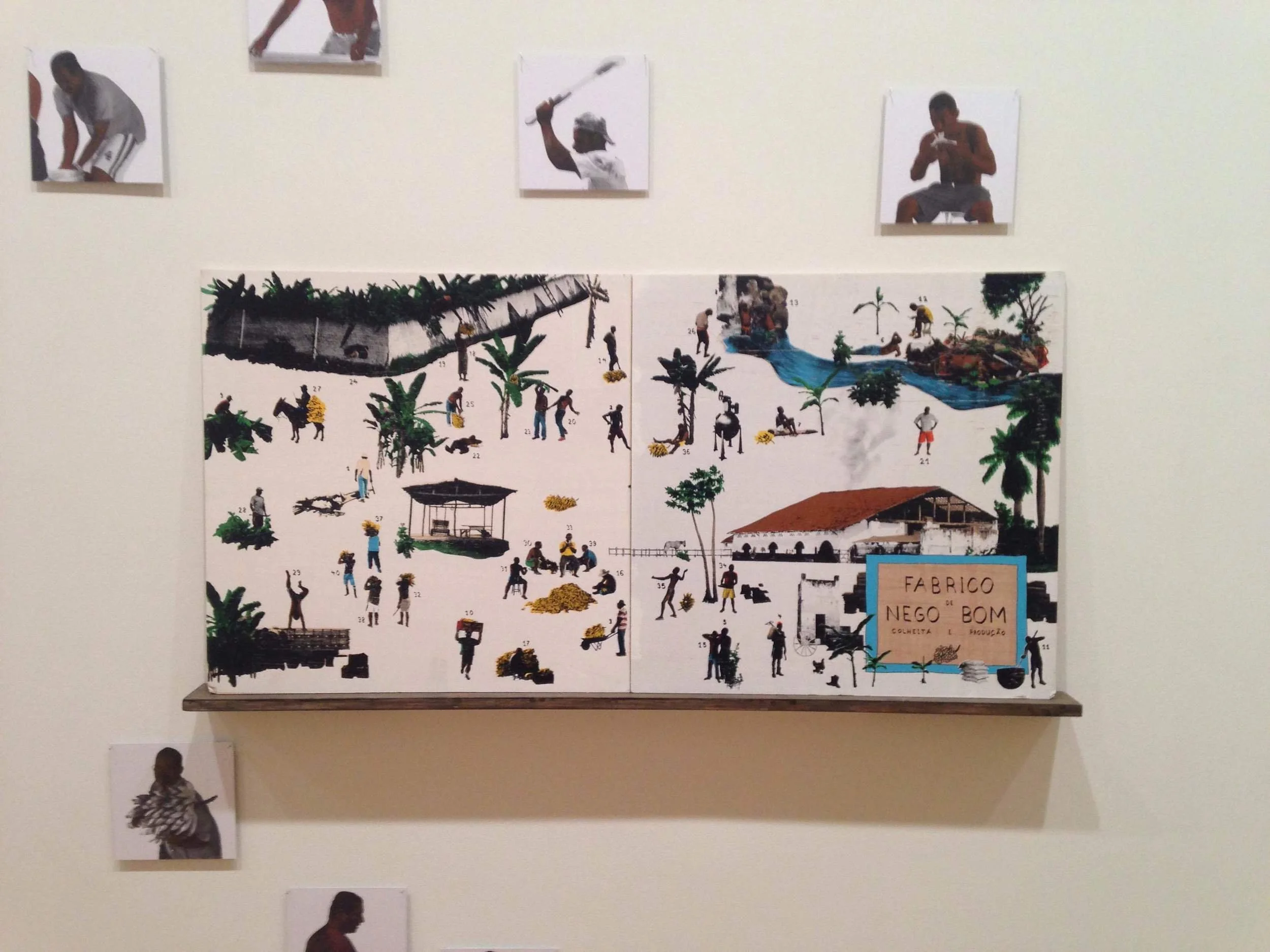
If that's too many words for you, here's a cool picture from the Auckland Art Gallery. They had an exhibit on called 'Called Space to Dream'. They had dreamy paintings of banana plantations alongside an ethereal sculpture that stimulated the senses with aromas of turmeric and cinnamon.
Kokako
One of the great things about developing a brand is that it lets you step into another world. In developing the identity for Kokako, an app that tracks the use of Māori language over the radio, I got to do just that. I researched the rich visual history of the Māori people and found plenty to be inspired by, including bold graphic shapes and colours and a refreshingly honest typographic style. The logo plays off this background as well as the rhythmic phonetics inherent in the name. The design won a Purple Pin at the 2016 Best Awards. Designed with Salted Herring.


NZ Airports: Branding
The design of the NZ Airports Association a shameless celebration of the visual language synonymous with airports. We developed the identity by drawing inspiration from runway markings, san-serif typography, ticker panels, pictograms, yellow, black and the unending blue sky. The website also got a refresh. The site is primarily a resource library, so a design system was developed that could accommodate a range of publication types and contents. Created with Salted Herring.


Wild Eyes
Wild Eyes is a social media platform for Kiwi kids to participate in and share nature missions. The quirky logo was inspired by a child-like fascination with laser-eyed cats. It expands from the centre, suggesting that opening your eyes will also open your mind to new experiences. Designed with Salted Herring.

Wrong theory
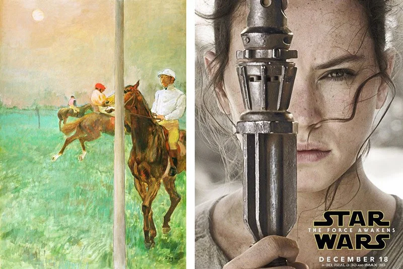
A few years back now, Scott Dadich, at Wired Magazine, wrote an article about intentionally getting the design wrong in order to make it right. He lead with an example by the artist Edgar Degas, Jockeys Before the Race. In the painting, Degas breaks with accepted convention of the time and ‘ruined’ the composition with a pole through the subjects head. Dadich argues that this small act of subterfuge is the driving force behind creativity. It challenges stale conventions and engages the apathetic gaze. I bring it up because the recent revival of the Star Wars franchise has bought with it a poster design that uses a similar technique. It’s reassuring that this simple trick, when used with restraint and consideration, is just as effective today as it was in the 1870’s.
St Fabiola
St Fabiola is the pseudonym for Kirsten Sutherland. She creates embroidered art that’s imbedded with scientific, spiritual and mythical themes. I drew on this by exploring an eclectic mix of images, each touching on an aspect of her work. In particular, I was inspired by the symbolism of heraldry, the profile of legendary heroines, as well as the silhouettes created by cloaks, hoods and scarfs. The resulting visual identity, which represents the iconic image of St Fabiola, draws on all these findings. It’s a stylised, self-assured depiction of the heroine. This is reinforced further through the typography and colour palette with is strong but feminine. Designed with Salted Herring.


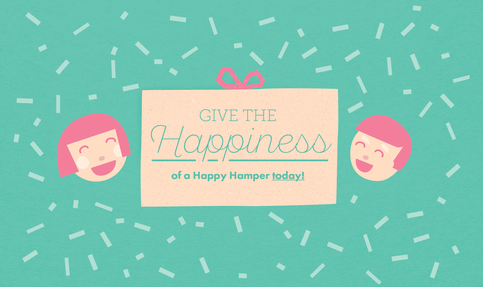
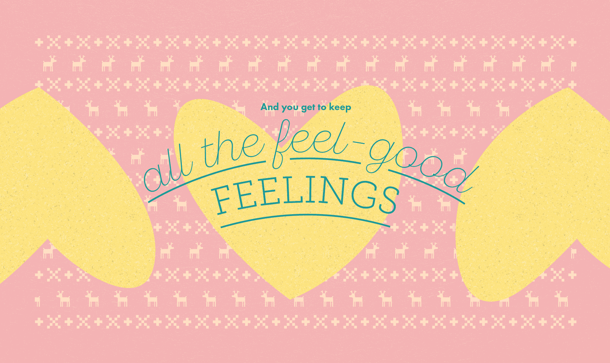
Happy Hamper
The Happy Hamper to help feed hungry kiwi kids. The design tells a visual story of how The Happy Hamper swaps xmas treats for everyday luxuries, like baked beans and fresh bread. It uses a friendly paper cut-out style illustrations, bright colours and humorous copywriting to engage the audience. Designed with Salted Herring.


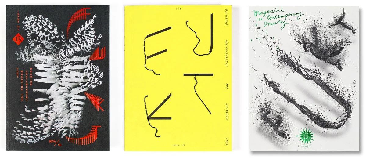
Semi Permanent: Ariane Spanier
At Semi Permanent conference this week I had the pleasure of listening to Berlin designer Ariane Spanier discuss her process. She talked about the influence of her childhood, design school and interning at Sagmeister Inc. Spanier showed us examples of her work, it’s playful, and explorative in style. This act of experimenting was the beating heart of her style. Her typography is rich and expressive. She uses layering, texture and movement to give it a fun conceptual edge. Her work for Fukt, a magazine for contemporary drawing, was particularly stunning. With each issue she starts from scratch, focusing her energies on a single experimental mark-making technique. For one cover the typeface was constructed with pencil lead floating in mid-air. In another design she used motion-capture to create abstract shapes. For the latest cover of Fukt she combines fluid lines and bold blocks to create avant-garde letterforms. It was beautiful.
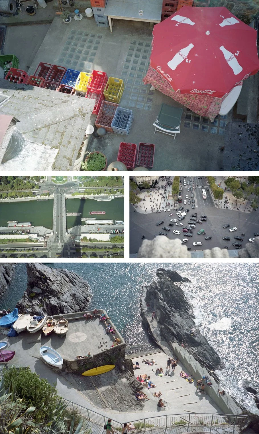
A good view
We’ve always loved capturing a good view. Here are some of our latest efforts.
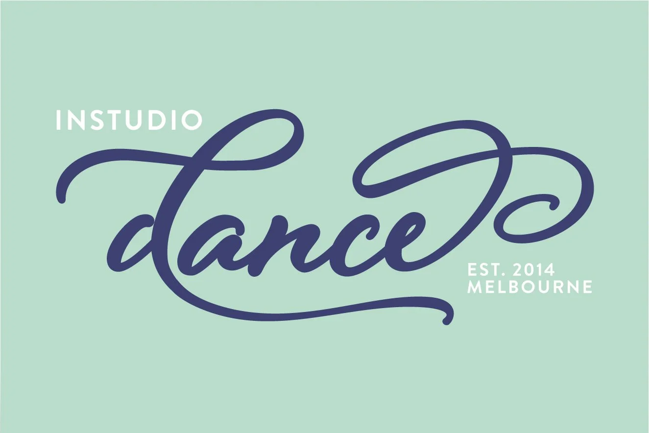
InStudio: Logo design
InStudio Dance approached Make Believe to create the identity for their new dance school. They love to teach children the joy of movement. We depicted this by creating a logo that is fluid and energetic.
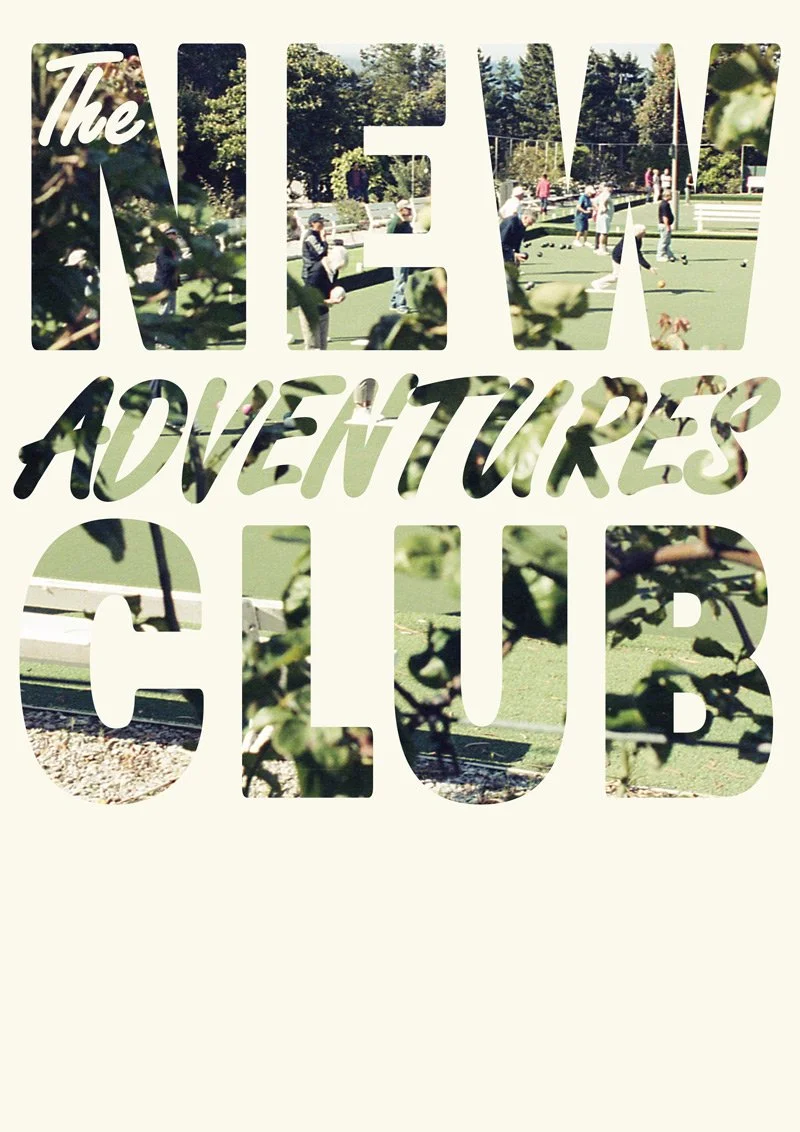
New Adventures Club
Introducing a new initiative from Make Believe, ‘The New Adventures Club’. It's only the most awesome friendship club in the whole world, with a mission is to seek out and share new adventures. New food. New music. New movies. New friends. New experiences. New art. New ideas. New indulgences.